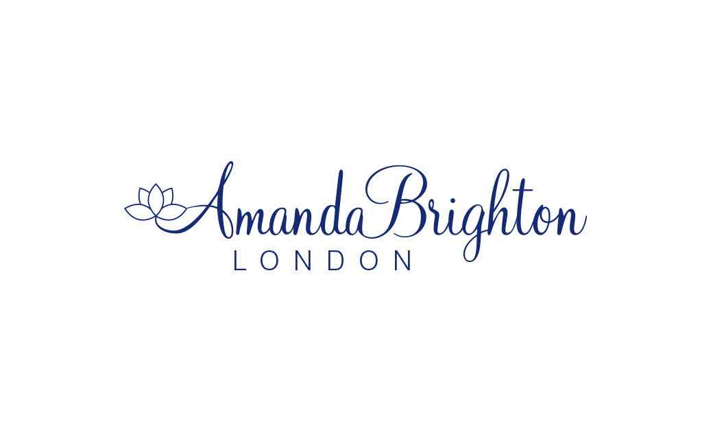
Elegant brand identity for Anglo-Tibetan jewellery designer Amanda Brighton.
Context
Amanda Brighton is a London-based jewellery designer known for blending Western contemporary aesthetics with Eastern influences of colour, craftsmanship and harmony.
Role
Lead designer
Goal
Develop a logo that reflects her refined, international brand and resonates with a clientele drawn to both elegance and cultural depth.
Challenge
The brand needed a logo that would appeal to a sophisticated global audience while reflecting Amanda’s cross-cultural design philosophy. It had to feel at home on jewellery boxes, website headers and fine printed materials.
Approach
I combined a flowing script typeface for a personal, signature-like feel with a minimal lotus motif - a nod to her Eastern influences and her jewellery’s sense of harmony. A deep navy blue colour palette was chosen for its association with timeless elegance and luxury. The design balances modern simplicity with a handcrafted touch, mirroring Amanda’s own aesthetic.
Outcome
A distinctive, refined logo that embodies the cross-cultural spirit of Amanda’s brand.
Works seamlessly across print, packaging and digital platforms.
Enhanced brand recognition and consistency across her international presence.