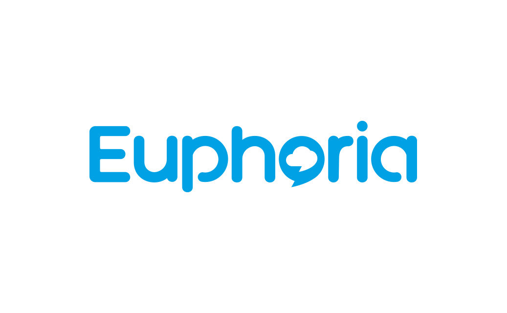
Refreshed and modernised logo for Euphoria, a leading cloud-based telecommunications provider.
Context
Euphoria is a South African telecommunications company specialising in cloud-hosted business phone systems. As the company evolved, it needed a refreshed logo that reflected its innovative technology and approachable customer-centric ethos.
Role
Lead designer
Goal
Modernise the visual identity to feel contemporary and digital-first while maintaining brand recognition.
Challenge
The existing logo felt dated and no longer reflected the company’s position as a leading, forward-looking telecoms provider. The refreshed logo had to strike a balance between keeping the brand familiar to existing customers and signalling innovation to new ones.
Approach
I simplified and modernised the wordmark using a rounded, approachable typeface to communicate friendliness and accessibility. The distinctive speech bubble motif was integrated into the letter “o,” highlighting Euphoria’s focus on communication and connectivity. A clean, vibrant blue was retained to maintain continuity and convey trust and reliability.
Outcome
A refreshed and versatile logo that feels modern, approachable and relevant to the digital era
Successfully retained brand recognition while improving visual appeal across digital and print applications
Strengthened the company’s visual identity, supporting its positioning as a trusted, innovative telecoms provider