Dynamic and energetic brand identity for Embark, a triathlon coaching and community platform.
Context
Embark is a South African triathlon coaching business that helps athletes of all levels prepare for endurance events through expert training plans, coaching and a vibrant community. The brand needed a bold and energetic identity that would resonate with endurance athletes and stand out in a competitive sports market.
Role
Lead designer
Goal
Create a distinctive logo that embodies energy, movement and determination while being versatile for use across merchandise, digital platforms and event branding.
Challenge
The logo had to feel strong and athletic, appealing to both beginner and experienced triathletes. It needed to be simple enough for use on apparel, gear and promotional materials, yet dynamic enough to reflect the brand’s focus on performance and progression.
Approach
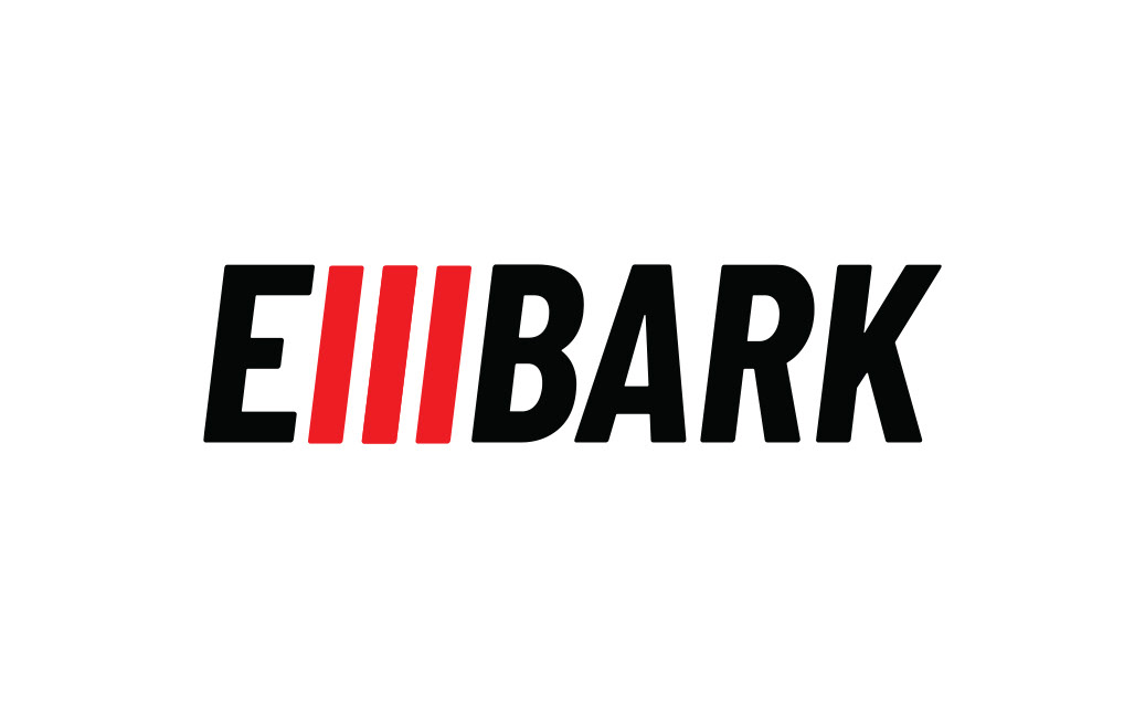
I designed a bold wordmark with a forward-leaning italic form to convey motion and momentum. The three red slashes at the heart of the logo symbolise the three disciplines of triathlon - swim, bike and run - as well as energy and forward drive. The pairing of black and red gives the brand a striking and competitive look while ensuring legibility and impact across all applications.
Outcome
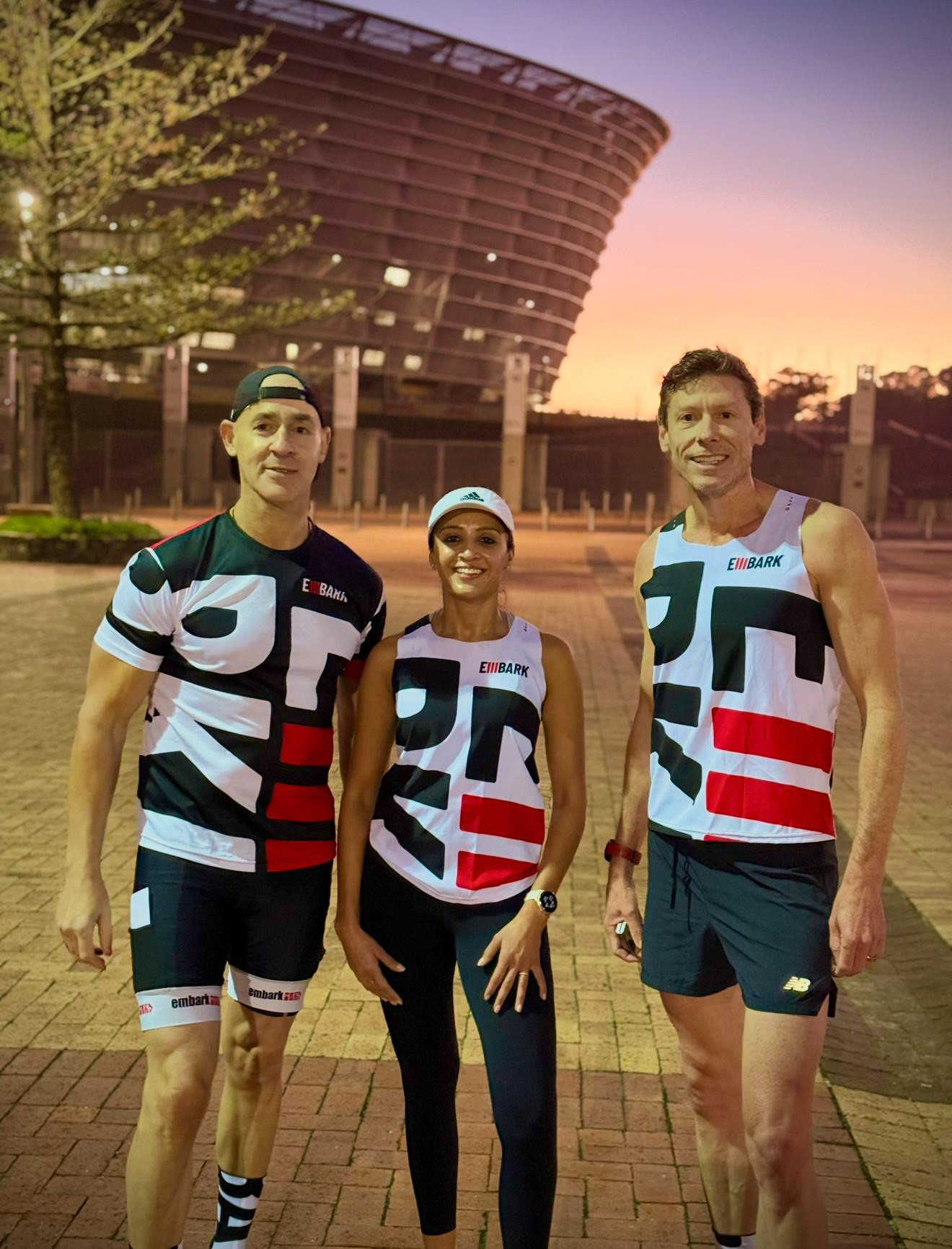
A memorable and versatile logo that captures the energy and progression central to triathlon training
Works effectively across apparel, race-day branding, marketing materials and digital platforms
Strengthened Embark’s presence in the endurance sports community and reinforced its identity as a modern, performance-driven coaching brand